دروس CardView باستخدام RecyclerView في Android Studio
في Android ، يعد CardView عنصرًا رئيسيًا آخر يمكنه تمثيل المعلومات بطريقة البطاقة بظل مسقط يسمى الارتفاع ونصف قطر الزاوية والذي يبدو متسقًا عبر النظام الأساسي. تم تقديم CardView في تصميم المواد في المستوى 21 من واجهة برمجة التطبيقات (Android 5.0 أي Lollipop).

يستخدم CardView خاصية الارتفاع على Lollipop للظلال ويعود إلى تطبيق محاكاة الظل المخصص على الأنظمة الأساسية القديمة.
تعد هذه الأداة الجديدة خطوة كبيرة لعرض البيانات / المعلومات داخل البطاقات. يمكننا بسهولة تصميم واجهة مستخدم جيدة المظهر عندما قمنا بدمج CardView مع RecyclerView . CardView هي مجموعة ViewGroup التي يمكن إضافتها في نشاطنا أو جزء باستخدام ملف XML تخطيطي.
جدول المحتويات
كود XML الأساسي لـ CardView في Android Studio :
<android.support.v7.widget.CardView
  xmlns:card_view="http://schemas.android.com/apk/res-auto"
  android:layout_width="match_parent"
  android:layout_height="wrap_content">
  </android.support.v7.widget.CardView>
Dependency Gradle لاستخدام CardView
تعد أداة CardView جزءًا من مكتبة منفصلة صالحة لمستوى API 7 أو أعلى. أضف التبعية التالية في ملف بناء Gradle الخاص بك لاستخدام CardView.
أضف داخل Gradle Scripts> build.gradle (الوحدة: التطبيق) والتبعيات الداخلية
dependencies {
  compile 'com.android.support:cardview-v7:23.0.1'
  }

سمات وخصائص CardView في Android
الآن دعنا نناقش بعض السمات الشائعة لـ CardView التي تساعدنا على تهيئتها في تخطيطنا (xml).
1. card_view:cardBackgroundColor :
تُستخدم هذه السمة لتعيين لون الخلفية لـ CardView. يمكننا أيضًا ضبط لون الخلفية برمجيًا باستخدام طريقة setCardBackgroundColor (لون int).
أدناه قمنا بتعيين اللون الأسود في خلفية CardView ..
 <android.support.v7.widget.CardView
  android:id="@+id/card_view"
  android:layout_width="250dp"
  android:layout_height="250dp"
  android:layout_gravity="center"
  card_view:cardBackgroundColor="#000">

  <TextView
  android:layout_width="match_parent"
  android:layout_height="match_parent"
  android:text="AbhiAndroid"
  android:textColor="#fff"
  android:textSize="20sp" />

  </android.support.v7.widget.CardView>
 2.
2.
card view:cardCornerRadius :
تُستخدم هذه السمة لتعيين نصف قطر الزاوية لـ CardView. يمكننا أيضًا ضبط نصف قطر الزاوية برمجيًا باستخدام طريقة setRadius (نصف قطر الطفو).
أدناه قمنا بتعيين الخلفية السوداء ونصف قطر الزاوية لـ CardView.
 <android.support.v7.widget.CardView
  android:id="@+id/card_view"
  android:layout_width="250dp"
  android:layout_height="250dp"
  android:layout_gravity="center"
  card_view:cardCornerRadius="20dp"
  card_view:cardBackgroundColor="#000"><!--
  corner radius value 20dp and black background
  -->

  <TextView
  android:layout_width="match_parent"
  android:layout_height="match_parent"
  android:text="AbhiAndroid"
  android:textColor="#fff"
  android:textSize="20sp" />

  </android.support.v7.widget.CardView>
 3.
3.
card_view:cardElevation
تُستخدم هذه السمة لتعيين ارتفاع CardView. يُستخدم الارتفاع لإظهار ظل CardView. يمكننا أيضًا ضبط قيمة ارتفاع البطاقة برمجيًا باستخدام طريقة setCardElevation (ارتفاع تعويم).
أدناه قمنا بتعيين الخلفية السوداء وقيمة الارتفاع لـ CardView.
<android.support.v7.widget.CardView
  android:id="@+id/card_view"
  android:layout_width="250dp"
  android:layout_height="250dp"
  android:layout_gravity="center"
  card_view:cardElevation="30dp"
  card_view:cardBackgroundColor="#000"><!--
  card elevation value 30dp and black background
  -->

  <TextView
  android:layout_width="match_parent"
  android:layout_height="match_parent"
  android:text="AbhiAndroid"
  android:textColor="#fff"
  android:textSize="20sp" />

  </android.support.v7.widget.CardView>
 4. card_view: contentPadding:
تُستخدم هذه السمة لتعيين الحشو الداخلي بين حواف البطاقة وأطراف CardView. تُستخدم هذه السمة لتعيين الحشو المتساوي بين جميع حواف البطاقة وأطراف CardView. يمكننا أيضًا ضبط المساحة المتروكة من الحواف السفلية والعليا واليسرى واليمنى. يمكننا أيضًا ضبط الحشو برمجيًا باستخدام طريقة setContentPadding (int left ، int top ، int right ، int bottom).
أدناه قمنا بتعيين الخلفية السوداء وقيمة 20dp للحشو الداخلي بين حواف البطاقة والأطفال من CardView.
<android.support.v7.widget.CardView
  android:id="@+id/card_view"
  android:layout_width="250dp"
  android:layout_height="250dp"
  android:layout_gravity="center"
  card_view:cardBackgroundColor="#000"
  card_view:cardCornerRadius="20dp"
  card_view:cardElevation="30dp"
  card_view:contentPadding="20dp"><!--
  content padding value 20dp and black background
  -->

  <TextView
  android:layout_width="match_parent"
  android:layout_height="match_parent"
  android:text="AbhiAndroid"
  android:textColor="#fff"
  android:textSize="20sp" />

  </android.support.v7.widget.CardView>
5. Cardview: contentPadding
تُستخدم هذه السمة لتعيين الحشو الداخلي بين الحافة السفلية للبطاقة وتوابع CardView.
أدناه قمنا بتعيين الخلفية السوداء وقيمة 20dp للحشو الداخلي بين الحافة السفلية للبطاقة والأطفال من CardView.
<android.support.v7.widget.CardView
  android:id="@+id/card_view"
  android:layout_width="250dp"
  android:layout_height="250dp"
  android:layout_gravity="center"
  card_view:cardBackgroundColor="#000"
  card_view:cardElevation="10dp"
  card_view:contentPaddingBottom="20dp"><!--
  content bottom padding value 20dp and black background
  -->
  <RelativeLayout
  android:layout_width="match_parent"
  android:layout_height="match_parent">

  <TextView
  android:layout_width="wrap_content"
  android:layout_height="wrap_content"
  android:layout_alignParentBottom="true"
  android:text="AbhiAndroid"
  android:textColor="#fff"
  android:textSize="20sp" />
  </RelativeLayout>

  </android.support.v7.widget.CardView>
6. cardview:contentPaddingLeft :
تُستخدم هذه السمة لتعيين الحشو الداخلي بين الحافة اليسرى للبطاقة والأبناء في CardView.
أدناه قمنا بتعيين الخلفية السوداء وقيمة 20dp للحشو الداخلي بين الحافة اليسرى للبطاقة والأطفال من CardView.
 <android.support.v7.widget.CardView
  android:id="@+id/card_view"
  android:layout_width="250dp"
  android:layout_height="250dp"
  android:layout_gravity="center"
  card_view:cardBackgroundColor="#000"
  card_view:cardElevation="10dp"
  card_view:contentPaddingLeft="20dp"><!--
  content left padding value 20dp and black background
  -->
  <RelativeLayout
  android:layout_width="match_parent"
  android:layout_height="match_parent">

  <TextView
  android:layout_width="wrap_content"
  android:layout_height="wrap_content"
  android:text="AbhiAndroid"
  android:textColor="#fff"
  android:textSize="20sp" />
  </RelativeLayout>

  </android.support.v7.widget.CardView>
7. cardview:contentPaddingRight :
تُستخدم هذه السمة لتعيين الحشو الداخلي بين الحافة اليمنى للبطاقة وتوابع CardView.
أدناه قمنا بتعيين الخلفية السوداء وقيمة 20dp للحشو الداخلي بين الحافة اليمنى للبطاقة والأطفال من CardView.
<android.support.v7.widget.CardView
  android:id="@+id/card_view"
  android:layout_width="250dp"
  android:layout_height="250dp"
  android:layout_gravity="center"
  card_view:cardBackgroundColor="#000"
  card_view:cardElevation="10dp"
  card_view:contentPaddingRight="20dp"><!--
  content right padding value 20dp and black background
  -->
  <RelativeLayout
  android:layout_width="match_parent"
  android:layout_height="match_parent">

  <TextView
  android:layout_width="wrap_content"
  android:layout_height="wrap_content"
  android:layout_alignParentRight="true"
  android:text="AbhiAndroid"
  android:textColor="#fff"
  android:textSize="20sp" />
  </RelativeLayout>

  </android.support.v7.widget.CardView>
8. : cardview:contentPaddingTop :
تُستخدم هذه السمة لتعيين الحشو الداخلي بين الحافة العلوية للبطاقة والأبناء في CardView.
أدناه قمنا بتعيين الخلفية السوداء وقيمة 20dp للحشو الداخلي بين الحافة العلوية للبطاقة والأطفال من CardView.
 <android.support.v7.widget.CardView
  android:id="@+id/card_view"
  android:layout_width="250dp"
  android:layout_height="250dp"
  android:layout_gravity="center"
  card_view:cardBackgroundColor="#000"
  card_view:cardElevation="10dp"
  card_view:contentPaddingTop="20dp"><!--
  content left padding value 20dp and black background
  -->
  <RelativeLayout
  android:layout_width="match_parent"
  android:layout_height="match_parent">

  <TextView
  android:layout_width="wrap_content"
  android:layout_height="wrap_content"
  android:text="AbhiAndroid"
  android:textColor="#fff"
  android:textSize="20sp" />
  </RelativeLayout>

  </android.support.v7.widget.CardView>
طرق مهمة لعرض البطاقة CardView
دعنا نناقش بعض الطرق المهمة لـ CardView التي قد يتم استدعاؤها من أجل إدارة CardView.
1. setCardBackgroundColor ( int color): تُستخدم هذه الطريقة لتعيين لون الخلفية لـ CardView.
أدناه قمنا بتعيين لون الخلفية لـ CardView.
 // init the CardView
  CardView cardView = (CardView) findViewById(R.id.card_view);
  // set black color for the Background of the CardView
  cardView.setCardBackgroundColor(Color.BLACK);
2. setCardElevation (float): تُستخدم هذه الطريقة لتعيين الارتفاع المتوافق مع الإصدارات السابقة لـ CardView. تحدد هذه الطريقة القيمة بتنسيق نوع عائم.
أدناه قمنا بتعيين قيمة الارتفاع المتوافقة مع الإصدارات السابقة لـ CardView.
 // init the CardView
  CardView cardView = (CardView) findViewById(R.id.card_view);
  // set black color for the Background of the CardView
  cardView.setCardBackgroundColor(Color.BLACK);
  cardView.setCardElevation(20f); // backward compatible elevation value
3. getCardElevation (): تستخدم هذه الطريقة للحصول على قيمة الارتفاع التي حددناها باستخدام طريقة setCardElevation (float). ترجع هذه الطريقة قيمة نوع عائم.
أدناه ، قمنا أولاً بتعيين قيمة الارتفاع ثم نحصل على نفس قيمة CardView.
 // init the CardView
  CardView cardView = (CardView) findViewById(R.id.card_view);
  // set black color for the Background of the CardView
  cardView.setCardBackgroundColor(Color.BLACK);
  cardView.setCardElevation(20f); // set backward compatible elevation value
  float elevationValue=cardView.getCardElevation(); // get the card background compatible elevation value
4. setRadius ( float radius ): تُستخدم هذه الطريقة لتعيين قيمة نصف قطر الزاوية لـ CardView. تحدد هذه الطريقة القيمة بتنسيق نوع عائم.
أدناه قمنا بتعيين قيمة نصف قطر الزاوية لـ CardView.
 // init the CardView
  CardView cardView = (CardView) findViewById(R.id.card_view);
  // set black color for the Background of the CardView
  cardView.setCardBackgroundColor(Color.BLACK);
  cardView.setRadius(20f); // sets corner radius value
5. getRadius (): تُستخدم هذه الطريقة للحصول على قيمة نصف قطر الزاوية التي حددناها باستخدام طريقة setRadius (float radius). ترجع هذه الطريقة قيمة نوع عائم.
أدناه قمنا أولاً بتعيين قيمة نصف قطر الزاوية ثم نحصل على نفس قيمة CardView.
// init the CardView
  CardView cardView = (CardView) findViewById(R.id.card_view);
  // set black color for the Background of the CardView
  cardView.setCardBackgroundColor(Color.BLACK);
  cardView.setRadius(20f); // sets corner radius value
  float radiusValue=cardView.getRadius(); // get the corner radius value
6. setContentPadding ( int left, int top, int right, int bottom ): تُستخدم هذه الطريقة لضبط الحشوة بين حواف البطاقة وأطراف CardView . تحدد هذه الطريقة قيمة نوع int لحشو المحتوى. تقوم هذه الطريقة بتعيين الحشو المتساوي بين جميع حواف البطاقة وأطفال CardVie
أدناه قمنا بتعيين قيمة المساحة المتروكة بين حواف البطاقة وأطراف CardView.
// init the CardView
  CardView cardView = (CardView) findViewById(R.id.card_view);
  // set black color for the Background of the CardView
  cardView.setCardBackgroundColor(Color.BLACK);
  cardView.setContentPadding(10,10,10,10); // set the padding between the card's edges and the children of the CardView
7. getContentPaddingBottom (): تُستخدم هذه الطريقة للحصول على الحشو الداخلي قبل الحافة السفلية للبطاقة. ترجع هذه الطريقة قيمة نوع int.
أدناه قمنا أولاً بتعيين حشوة المحتوى ثم نحصل على الحشو الداخلي قبل الحافة السفلية للبطاقة.
// init the CardView
  CardView cardView = (CardView) findViewById(R.id.card_view);
  // set black color for the Background of the CardView
  cardView.setCardBackgroundColor(Color.BLACK);
  cardView.setContentPadding(10, 10, 10, 10); // set the padding between the card's edges and the children of the CardView
  int bottomPadding = cardView.getPaddingBottom(); // get the inner padding before the Card's bottom edge.
8. getContentPaddingLeft (): تُستخدم هذه الطريقة للحصول على الحشو الداخلي بعد الحافة اليسرى للبطاقة. ترجع هذه الطريقة قيمة نوع int.
أدناه قمنا أولاً بتعيين حشوة المحتوى ثم نحصل على الحشو الداخلي بعد الحافة اليسرى للبطاقة.
// init the CardView
  CardView cardView = (CardView) findViewById(R.id.card_view);
  // set black color for the Background of the CardView
  cardView.setCardBackgroundColor(Color.BLACK);
  cardView.setContentPadding(10, 10, 10, 10); // set the padding between the card's edges and the children of the CardView
  int leftPadding = cardView.getPaddingLeft(); // get the inner padding after the Card's left edge.
9. getContentPaddingRight (): تُستخدم هذه الطريقة للحصول على الحشو الداخلي قبل الحافة اليمنى للبطاقة. ترجع هذه الطريقة قيمة نوع int.
أدناه ، قمنا أولاً بتعيين حشوة المحتوى ثم نحصل على الحشوة الداخلية قبل الحافة اليمنى للبطاقة.
 // init the CardView
  CardView cardView = (CardView) findViewById(R.id.card_view);
  // set black color for the Background of the CardView
  cardView.setCardBackgroundColor(Color.BLACK);
  cardView.setContentPadding(10, 10, 10, 10); // set the padding between the card's edges and the children of the CardView
  int rightPadding = cardView.getPaddingLeft(); // get the inner padding before the Card's right edge.
10. getContentPaddingTop (): تُستخدم هذه الطريقة للحصول على الحشو الداخلي بعد الحافة العلوية للبطاقة. ترجع هذه الطريقة قيمة نوع int.
أدناه ، قمنا أولاً بتعيين حشوة المحتوى ثم نحصل على الحشو الداخلي بعد الحافة العلوية للبطاقة.
 // init the CardView
  CardView cardView = (CardView) findViewById(R.id.card_view);
  // set black color for the Background of the CardView
  cardView.setCardBackgroundColor(Color.BLACK);
  cardView.setContentPadding(10, 10, 10, 10); // set the padding between the card's edges and the children of the CardView
  int topPadding = cardView.getPaddingLeft(); // get the inner padding after the Card's top edge.
مثال على CardView باستخدام RecyclerView كـ GridView في Android Studio
يوجد أدناه مثال RecyclerView As GridView حيث نعرض قائمة بأسماء الأشخاص مع صورهم ذات الاتجاه الرأسي الافتراضي باستخدام RecyclerView. في هذا المثال ، نستخدم LinearLayoutManager مع الاتجاه الرأسي الافتراضي لعرض العناصر. أولاً ، نعلن عن RecyclerView في ملف XML الخاص بنا ثم نحصل على مرجع له في نشاطنا. بعد ذلك نقوم بإنشاء قائمتين ArrayList لأسماء الأشخاص وصورهم. بعد ذلك قمنا بتعيين LinearLayoutManager وأخيراً قمنا بتعيين المحول لإظهار عناصر القائمة في RecyclerView. عندما ينقر المستخدم على عنصر ما ، سيتم عرض الصورة بالحجم الكامل على الشاشة التالية.
يمكنك أدناه تنزيل الكود ، والاطلاع على الإخراج النهائي والشرح خطوة بخطوة للمثال :
تنزيل كود (كلمة المرور: abhiandroid)
الخطوة 1: إنشاء مشروع جديد وتسميته RecyclerViewExample.
الخطوة 2: افتح نصوص Gradle> build.gradle (الوحدة: التطبيق) وأضف تبعية RecyclerView & CardView Library فيه.
 apply plugin: 'com.android.application'
  android {
  compileSdkVersion 24
  buildToolsVersion "24.0.1"
  defaultConfig {
  applicationId "abhiandroid.com.recyclerviewexample"
  minSdkVersion 16
  targetSdkVersion 24
  versionCode 1
  versionName "1.0"
  }
  buildTypes {
  release {
  minifyEnabled false
  proguardFiles getDefaultProguardFile('proguard-android.txt'), 'proguard-rules.pro'
  }
  }
  }
  dependencies {
  compile fileTree(dir: 'libs', include: ['*.jar'])
  testCompile 'junit:junit:4.12'
  compile 'com.android.support:appcompat-v7:24.1.1'
  compile "com.android.support:recyclerview-v7:23.0.1" // dependency file for RecyclerView
  compile 'com.android.support:cardview-v7:23.0.1' // CardView dependency file

  }
الخطوة 3: افتح res -> layout -> activity_main.xml (أو) main.xml وأضف الكود التالي:
في هذه الخطوة ، نقوم بإنشاء RecyclerView في ملف XML الخاص بنا.
 <?xml version="1.0" encoding="utf-8"?>
  <RelativeLayout xmlns:android="http://schemas.android.com/apk/res/android"
  xmlns:tools="http://schemas.android.com/tools"
  android:layout_width="match_parent"
  android:layout_height="match_parent"
  tools:context="abhiandroid.com.recyclerviewexample.MainActivity">

  <android.support.v7.widget.RecyclerView
  android:id="@+id/recyclerView"
  android:layout_width="match_parent"
  android:layout_height="wrap_content" />
  </RelativeLayout>
الخطوة 4: قم بإنشاء ملف XML جديد rowlayout.xml لعنصر قائمة RecyclerView والصق الكود التالي فيه.
في هذه الخطوة ، نقوم بإنشاء ملف xml جديد لصف العناصر حيث نقوم بإنشاء TextView و ImageView لإظهار البيانات بتنسيق الشبكة. في هذا نحدد طرق العرض داخل CardView لعرض العناصر في شكل بطاقات.
 <android.support.v7.widget.CardView android:id="@+id/card_view"
  android:layout_width="match_parent"
  android:layout_height="wrap_content"
  card_view:cardElevation="20dp"
  android:layout_margin="10dp"
  card_view:contentPadding="20dp"
  xmlns:card_view="http://schemas.android.com/apk/res-auto"
  xmlns:tools="http://schemas.android.com/tools"
  xmlns:android="http://schemas.android.com/apk/res/android">

  <RelativeLayout
  android:layout_width="match_parent"
  android:layout_height="wrap_content"
  android:layout_gravity="center">

  <ImageView
  android:id="@+id/image"
  android:layout_width="100dp"
  android:layout_height="100dp"
  android:layout_centerHorizontal="true"
  android:src="@drawable/person1" />


  <TextView
  android:id="@+id/name"
  android:layout_width="wrap_content"
  android:layout_height="wrap_content"
  android:layout_below="@+id/image"
  android:layout_centerHorizontal="true"
  android:linksClickable="true"
  android:text="https://abhiandroid.com"
  android:textColor="#000"
  android:textSize="20sp" />
  </RelativeLayout>

  </android.support.v7.widget.CardView>
الخطوة 5: الآن افتح التطبيق -> جافا -> الحزمة -> MainActivity.java وأضف الكود أدناه.
في هذه الخطوة أولاً نحصل على مرجع RecyclerView. بعد ذلك نقوم بإنشاء قائمتين ArrayList لأسماء الأشخاص وصورهم. بعد ذلك قمنا بتعيين LinearLayoutManager وأخيراً قمنا بتعيين المحول لإظهار عناصر القائمة في RecyclerView.
package abhiandroid.com.recyclerviewexample;
  import android.os.Bundle;
  import android.support.v7.app.AppCompatActivity;
  import android.support.v7.widget.GridLayoutManager;
  import android.support.v7.widget.LinearLayoutManager;
  import android.support.v7.widget.RecyclerView;

  import java.util.ArrayList;
  import java.util.Arrays;

  public class MainActivity extends AppCompatActivity {

  // ArrayList for person names
  ArrayList personNames = new ArrayList<>(Arrays.asList("Person 1", "Person 2", "Person 3", "Person 4", "Person 5", "Person 6", "Person 7","Person 8", "Person 9", "Person 10", "Person 11", "Person 12", "Person 13", "Person 14"));
  ArrayList personImages = new ArrayList<>(Arrays.asList(R.drawable.person1, R.drawable.person2, R.drawable.person3, R.drawable.person4, R.drawable.person5, R.drawable.person6, R.drawable.person7,R.drawable.person1, R.drawable.person2, R.drawable.person3, R.drawable.person4, R.drawable.person5, R.drawable.person6, R.drawable.person7));

  @Override
  protected void onCreate(Bundle savedInstanceState) {
  super.onCreate(savedInstanceState);
  setContentView(R.layout.activity_main);
  // get the reference of RecyclerView
  RecyclerView recyclerView = (RecyclerView) findViewById(R.id.recyclerView);
  // set a LinearLayoutManager with default vertical orientaion
  LinearLayoutManager linearLayoutManager = new LinearLayoutManager(getApplicationContext());
  recyclerView.setLayoutManager(linearLayoutManager); // set LayoutManager to RecyclerView
  // call the constructor of CustomAdapter to send the reference and data to Adapter
  CustomAdapter customAdapter = new CustomAdapter(MainActivity.this, personNames,personImages);
  recyclerView.setAdapter(customAdapter); // set the Adapter to RecyclerView
  }
  }
الخطوة 6: إنشاء كلاس او فئه جديدة CustomAdapter.java داخل الحزمة وإضافة التعليمات البرمجية التالية.
في هذه الخطوة ، نقوم بإنشاء فئة CustomAdapter وتوسيع فئة RecyclerView.Adapter مع Viewholder بداخلها. بعد ذلك نقوم بتنفيذ الطرق التي تم تجاوزها وإنشاء مُنشئ للحصول على البيانات من النشاط.
في هذا المحول المخصص طريقتان مهمتان: الأولى هي onCreateViewHolder حيث نقوم بتضخيم عنصر التخطيط xml وتمريره إلى View Holder والآخر onBindViewHolder حيث نقوم بتعيين البيانات في طريقة العرض بمساعدة ViewHolder. أخيرًا ، قمنا بتنفيذ حدث setOnClickListener في عرض العناصر وعند النقر فوق العنصر ، نعرض الصورة المحددة بالحجم الكامل في النشاط التالي.
package abhiandroid.com.recyclerviewexample;
  import android.content.Context;
  import android.content.Intent;
  import android.support.v7.widget.RecyclerView;
  import android.view.LayoutInflater;
  import android.view.View;
  import android.view.ViewGroup;
  import android.widget.ImageView;
  import android.widget.TextView;

  import java.util.ArrayList;

  public class CustomAdapter extends RecyclerView.Adapter {

  ArrayList personNames;
  ArrayList personImages;
  Context context;

  public CustomAdapter(Context context, ArrayList personNames, ArrayList personImages) {
  this.context = context;
  this.personNames = personNames;
  this.personImages = personImages;
  }

  @Override
  public MyViewHolder onCreateViewHolder(ViewGroup parent, int viewType) {
  // infalte the item Layout
  View v = LayoutInflater.from(parent.getContext()).inflate(R.layout.rowlayout, parent, false);
  // set the view's size, margins, paddings and layout parameters
  MyViewHolder vh = new MyViewHolder(v); // pass the view to View Holder
  return vh;
  }

  @Override
  public void onBindViewHolder(MyViewHolder holder, final int position) {
  // set the data in items
  holder.name.setText(personNames.get(position));
  holder.image.setImageResource(personImages.get(position));
  // implement setOnClickListener event on item view.
  holder.itemView.setOnClickListener(new View.OnClickListener() {
  @Override
  public void onClick(View view) {
  // open another activity on item click
  Intent intent = new Intent(context, SecondActivity.class);
  intent.putExtra("image", personImages.get(position)); // put image data in Intent
  context.startActivity(intent); // start Intent
  }
  });

  }

  @Override
  public int getItemCount() {
  return personNames.size();
  }

  public class MyViewHolder extends RecyclerView.ViewHolder {
  // init the item view's
  TextView name;
  ImageView image;

  public MyViewHolder(View itemView) {
  super(itemView);

  // get the reference of item view's
  name = (TextView) itemView.findViewById(R.id.name);
  image = (ImageView) itemView.findViewById(R.id.image);

  }
  }
  }
الخطوة 7: قم بإنشاء ملف XML جديد activity_second.xml وأضف الكود أدناه فيه.
في هذه الخطوة ، نقوم بإنشاء ImageView في ملف XML الخاص بنا لإظهار الصورة المحددة بالحجم الكامل.
<?xml version="1.0" encoding="utf-8"?>
  <RelativeLayout xmlns:android="http://schemas.android.com/apk/res/android"
  xmlns:tools="http://schemas.android.com/tools"
  android:layout_width="match_parent"
  android:layout_height="match_parent"
  android:paddingBottom="@dimen/activity_vertical_margin"
  android:paddingLeft="@dimen/activity_horizontal_margin"
  android:paddingRight="@dimen/activity_horizontal_margin"
  android:paddingTop="@dimen/activity_vertical_margin"
  android:background="#fff">

  <ImageView
  android:id="@+id/selectedImage"
  android:layout_width="match_parent"
  android:layout_height="wrap_content"
  android:layout_centerInParent="true"
  android:scaleType="fitXY" />
  </RelativeLayout>
الخطوة 8: قم بإنشاء نشاط جديد وقم بتسميته SecondActivity.class وأضف الكود أدناه فيه.
في هذه الخطوة ، نحصل على مرجع ImageView ثم نحصل على Intent الذي تم تعيينه من محول النشاط السابق ثم أخيرًا قمنا بتعيين الصورة في ImageView.
package abhiandroid.com.recyclerviewexample;
  import android.content.Intent;
  import android.os.Bundle;
  import android.support.v7.app.AppCompatActivity;
  import android.widget.ImageView;

  public class SecondActivity extends AppCompatActivity {

  ImageView selectedImage;

  @Override
  protected void onCreate(Bundle savedInstanceState) {
  super.onCreate(savedInstanceState);
  setContentView(R.layout.activity_second);
  selectedImage = (ImageView) findViewById(R.id.selectedImage); // init a ImageView
  Intent intent = getIntent(); // get Intent which we set from Previous Activity
  selectedImage.setImageResource(intent.getIntExtra("image", 0)); // get image from Intent and set it in ImageView
  }
  }
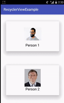
مخرج :
قم الآن بتشغيل التطبيق ويمكنك رؤية أسماء الأشخاص بصورهم بالاتجاه الرأسي الافتراضي في نمط البطاقة. انقر على أي صورة وسيتم فتحها بحجم كبير.
مثال CardView 2 في Android Studio
فيما يلي مثال CardView الذي نعرض فيه البيانات / المعلومات في البطاقة. في هذا المثال ، نستخدم ImageView و TextView داخل بطاقة. عندما ينقر المستخدم على البطاقة ، تظهر رسالة "حدث نقر CardView" على الشاشة بمساعدة Toast.
يمكنك أدناه تنزيل الكود ، والاطلاع على الإخراج النهائي والشرح خطوة بخطوة للمثال:
الخطوة 1: قم بإنشاء مشروع جديد وقم بتسميته CardViewExample.
الخطوة 2: افتح نصوص Gradle> build.gradle وأضف تبعية مكتبة CardView فيه.
apply plugin: 'com.android.application'
  android {
  compileSdkVersion 25
  buildToolsVersion "25.0.3"
  defaultConfig {
  applicationId "abhiandroid.com.cardviewexample"
  minSdkVersion 15
  targetSdkVersion 25
  versionCode 1
  versionName "1.0"
  testInstrumentationRunner "android.support.test.runner.AndroidJUnitRunner"
  }
  buildTypes {
  release {
  minifyEnabled false
  proguardFiles getDefaultProguardFile('proguard-android.txt'), 'proguard-rules.pro'
  }
  }
  }

  dependencies {
  compile fileTree(dir: 'libs', include: ['*.jar'])
  androidTestCompile('com.android.support.test.espresso:espresso-core:2.2.2', {
  exclude group: 'com.android.support', module: 'support-annotations'
  })
  compile 'com.android.support:appcompat-v7:25.3.1'
  compile 'com.android.support.constraint:constraint-layout:1.0.2'
  testCompile 'junit:junit:4.12'
  compile 'com.android.support:cardview-v7:23.0.1' // CardView dependency file
  }
الخطوة 3: افتح res -> layout -> activity_main.xml (أو) main.xml وأضف الكود التالي:
في هذه الخطوة ، نقوم بإنشاء ImageView و TextView داخل CardView الخاص بنا. نستخدم أيضًا الارتفاع والخلفية والسمات الأخرى لبرنامج CardView.
 <LinearLayout xmlns:android="http://schemas.android.com/apk/res/android"
  xmlns:card_view="http://schemas.android.com/apk/res-auto"
  xmlns:tools="http://schemas.android.com/tools"
  android:layout_width="match_parent"
  android:layout_height="match_parent"
  android:orientation="vertical">

  <android.support.v7.widget.CardView
  android:id="@+id/card_view"
  android:layout_width="250dp"
  android:layout_height="250dp"
  android:layout_gravity="center"
  card_view:cardBackgroundColor="#000"
  card_view:cardElevation="20dp"
  card_view:contentPadding="20dp">

  <RelativeLayout
  android:layout_width="match_parent"
  android:layout_height="wrap_content"
  android:layout_gravity="center">

  <ImageView
  android:id="@+id/imageView"
  android:layout_width="wrap_content"
  android:layout_height="wrap_content"
  android:layout_centerHorizontal="true"
  android:src="@drawable/abhiandroid" />


  <TextView
  android:layout_width="wrap_content"
  android:layout_height="wrap_content"
  android:layout_below="@+id/imageView"
  android:layout_centerHorizontal="true"
  android:linksClickable="true"
  android:text="https://abhiandroid.com"
  android:textColor="#fff"
  android:textSize="20sp" />
  </RelativeLayout>

  </android.support.v7.widget.CardView>

  </LinearLayout>
الخطوة 4: الآن افتح التطبيق -> java -> package -> MainActivity.java وأضف الكود أدناه.
في هذه الخطوة ، نحصل أولاً على مرجع CardView ثم نضبط قيمة نصف قطر الزاوية. أخيرًا ، نقوم بتنفيذ حدث onClickListener على CardView بحيث إذا نقر المستخدم على CardView ، فسيتم عرض رسالة "حدث تم النقر على CardView" على الشاشة باستخدام Toast .
  package abhiandroid.com.cardviewexample;
  import android.os.Bundle;
  import android.support.v7.app.AppCompatActivity;
  import android.support.v7.widget.CardView;
  import android.view.View;
  import android.widget.Toast;

  public class MainActivity extends AppCompatActivity {


  @Override
  protected void onCreate(Bundle savedInstanceState) {
  super.onCreate(savedInstanceState);
  setContentView(R.layout.activity_main);
  // init the CardView
  CardView cardView = (CardView) findViewById(R.id.card_view);
  cardView.setRadius(20F); // set corner radius value
  // Implement onClickListener event on CardView
  cardView.setOnClickListener(new View.OnClickListener() {
  @Override
  public void onClick(View v) {
  Toast.makeText(MainActivity.this, "CardView clicked event ", Toast.LENGTH_LONG).show();
  }
  });

  }
  }
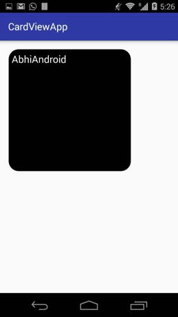
المخرجات :
الآن قم بتشغيل التطبيق وسترى CardView بسيطًا سيعرض المعلومات.