زر تبديل (تشغيل / إيقاف) البرنامج التعليمي مع مثال في Android Studio
في الاندرويد ، التبديل Switch هو الدولتين تبديل تبديل القطعة التي يمكن الاختيار بين خيارين. يتم استخدامه لعرض الحالة المحددة وغير المحددة للزر الذي يوفر تحكمًا في شريط التمرير للمستخدم. التبديل هو فئة فرعية من CompoundButton. إنه في الأساس زر إيقاف / تشغيل يشير إلى الحالة الحالية للمفتاح. يستخدم بشكل شائع في اختيار تشغيل / إيقاف تشغيل الصوت ، Bluetooth ، WiFi ، إلخ.
يسمح التبديل للمستخدمين بتغيير الإعداد بين حالتين مثل تشغيل / إيقاف تشغيل wifi و Bluetooth وما إلى ذلك من قائمة إعدادات هاتفك. تم تقديمه بعد إصدار Android 4.0 (مستوى API 14).
ملاحظة مهمة: كلا من Android Switch و ToggleButton هما الفئات الفرعية لفئة CompoundButton.
كود التبديل في XML:
<Switch
    android:id="@+id/simpleSwitch"
    android:layout_width="wrap_content"
    android:layout_height="wrap_content"/>

يوجد أدناه مثال على رمز فحصنا فيه الحالة الحالية للمحول.
// initiate a Switch
    Switch simpleSwitch = (Switch) findViewById(R.id.simpleSwitch);

    // check current state of a Switch (true or false).
    Boolean switchState = simpleSwitch.isChecked();
سمات وخصائص التبديل :
الآن دعنا نناقش سمات وخصائص زر التبديل Switch المهمة التي تساعدنا على تكوين Switch في ملف XML (التخطيط).
1. id: id هي سمة تُستخدم لتعريف المحول بشكل فريد.
<Switch
    android:id="@+id/simpleSwitch"
    android:layout_width="wrap_content"
    android:layout_height="wrap_content"/>
2. تم التحديد checked: يتم استخدام السمة المحددة للمفتاح لتعيين الحالة الحالية للمحول. يمكن أن تكون القيمة إما صحيحة أو خاطئة حيث تُظهر القيمة true الحالة المحددة بينما تُظهر القيمة false حالة التبديل التي لم يتم التحقق منها. القيمة الافتراضية للسمة المحددة خاطئة. يمكننا أيضًا ضبط الوضع الحالي برمجيًا.
أدناه ، قمنا بتعيين القيمة "true" للسمة المحددة التي تحدد الحالة الحالية لفحصها.
<Switch
    android:id="@+id/simpleSwitch"
    android:layout_width="wrap_content"
    android:layout_height="wrap_content"
    android:checked="true"/> <!-- set the current state of the Switch-->

أدناه قمنا بتعيين الحالة الحالية للتبديل في فئة جافا .
/*Add in Oncreate() funtion after setContentView()*/
    // initiate a Switch
    Switch simpleSwitch = (Switch) findViewById(R.id.simpleSwitch);

    //set the current state of a Switch
    simpleSwitch.setChecked(true);
3. النص Text : يتم استخدام سمة النص لتعيين النص في التبديل. يمكننا ضبط النص في xml وكذلك فيفئة java .
أدناه قمنا بتعيين النص "الصوت" للمحول.
<Switch
    android:id="@+id/simpleSwitch"
    android:layout_width="wrap_content"
    android:layout_height="wrap_content"
    android:layout_centerHorizontal="true"
    android:text="Sound" /> <!--displayed text of switch-->

في الكود أدناه قمنا بتعيين نص Switch via java class.
/*Add in Oncreate() funtion after setContentView()*/
    // initiate Switch
    Switch simpleSwitch = (Switch) findViewById(R.id.simpleSwitch);

    //displayed text of the Switch
    simpleSwitch.setText("switch");
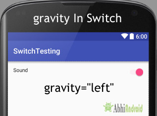
4. الجاذبية gravity : سمة الجاذبية هي سمة اختيارية تُستخدم للتحكم في محاذاة النص في Switch. يمكننا ضبط النص على اليسار ، اليمين ، الوسط ، أعلى ، أسفل ، center_vertical ، center_horizontal إلخ في Switch.
في الكود أدناه ، قمنا بتعيين الجاذبية اليسرى للنص في Switch.
<Switch
    android:id="@+id/simpleSwitch"
    android:layout_width="fill_parent"
    android:layout_height="wrap_content"
    android:text="Sound"
    android:checked="true"
    android:gravity="left"/><!--gravity of the Switch-->
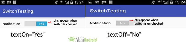
في المثال أدناه ، قمنا بتعيين textOn على أنه "نعم" و textOff على أنه "لا" لمحول.
<Switch
    android:id="@+id/simpleSwitch"
    android:layout_width="wrap_content"
    android:layout_height="wrap_content"
    android:checked="true"
    android:text="Notification"
    android:textOff="No"
    android:textOn="Yes"/><!-- text to be displayed whenever current state is checked-->
أدناه قمنا بتعيين textOn و textOff للمحول في فئة java.
/*Add in Oncreate() funtion after setContentView()*/
    Switch simpleSwitch = (Switch) findViewById(R.id.simpleSwitch); // initiate Switch

    simpleSwitch.setTextOn("On"); // displayed text of the Switch whenever it is in checked or on state
    simpleSwitch.setTextOff("Off"); // displayed text of the Switch whenever it is in unchecked i.e. off state
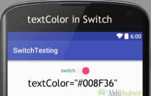
6. textColor: يتم استخدام سمة textColor لتعيين لون نص التبديل. تكون قيمة اللون على شكل "#argb" أو "#rgb" أو "#rrggbb" أو "#aarrggbb".
يوجد أدناه مثال على الكود مع شرح مضمن حيث قمنا بتعيين اللون الأحمر للنص المعروض للمفتاح.
<Switch
    android:id="@+id/simpleSwitch"
    android:layout_width="wrap_content"
    android:layout_height="wrap_content"
    android:checked="true"
    android:text="switch"
    android:layout_centerHorizontal="true"
    android:textOn="On"
    android:textOff="Off"
    android:gravity="center"
    android:textColor="#008F36"/><!-- Green color for displayed text-->
يوجد أدناه مثال على الكود الذي قمنا فيه بتعيين لون نص المحول برمجيًا.
/*Add in Oncreate() funtion after setContentView()*/
    Switch simpleSwitch = (Switch) findViewById(R.id.simpleSwitch);// initiate Switch

    simpleSwitch.setTextColor(Color.GREEN); //red color for displayed text of Switch
7. textSize: يتم استخدام سمة textSize لتعيين حجم نص المحول. يمكننا ضبط حجم النص في sp (مقياس بكسل مستقل) أو dp (كثافة بكسل).
يوجد أدناه مثال على الكود الذي قمنا فيه بتعيين حجم 25sp لنص المحول.
<Switch
    android:id="@+id/simpleSwitch"
    android:layout_width="wrap_content"
    android:layout_height="wrap_content"
    android:checked="true"
    android:text="switch"
    android:layout_centerHorizontal="true"
    android:textOn="On"
    android:textOff="Off"
    android:textColor="#f00"
    android:gravity="center"
    android:textSize="25sp"/> <!--25sp displayed text size-->

يوجد أدناه مثال على الكود الذي قمنا فيه بتعيين حجم نص المحول برمجيًا.
Switch simpleSwitch = (Switch) findViewById(R.id.simpleSwitch); // initiate Switch

    simpleSwitch.setTextSize(25); // set 25sp displayed text size of Switch
9. textStyle: يتم استخدام سمة textStyle لتعيين نمط النص لنص التبديل. أنماط النص الممكنة هي غامقة ومائلة وعادية. إذا احتجنا إلى استخدام نمطين أو أكثر لعرض النص ، فاستخدم "|" المشغل أو العامل.
أدناه قمنا بتعيين أنماط النص الغامق والمائل لنص مفتاح التحويل.
<Switch
    android:id="@+id/simpleSwitch"
    android:layout_width="wrap_content"
    android:layout_height="wrap_content"
    android:checked="false"
    android:text="switch"
    android:layout_centerHorizontal="true"
    android:textOn="On"
    android:textOff="Off"
    android:textColor="#f00"
    android:gravity="center"
    android:textSize="25sp"
    android:textStyle="bold|italic"/><!--bold and italic text style for displayed text-->

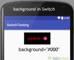
أدناه قمنا بتعيين اللون الأسود للخلفية واللون الأحمر للنص المعروض للمفتاح.
<Switch
    android:id="@+id/simpleSwitch"
    android:layout_width="wrap_content"
    android:layout_height="wrap_content"
    android:checked="true"
    android:text="switch"
    android:layout_centerHorizontal="true"
    android:textOn="On"
    android:textOff="Off"
    android:textColor="#f00"
    android:padding="20dp"
    android:gravity="center"
    android:textSize="25sp"
    android:background="#000"/><!-- black background color-->
أدناه قمنا بتعيين لون خلفية المحول برمجيًا.
Switch simpleSwitch = (Switch) findViewById(R.id.simpleSwitch);
    simpleSwitch.setBackgroundColor(Color.BLACK);
11. المساحة المتروكة padding : يتم استخدام خاصية المساحة المتروكة لتعيين المساحة المتروكة من اليسار أو اليمين أو أعلى أو أسفل في Switch.
- padding إلى اليمين : اضبط المساحة المتروكة من الجانب الأيمن من المفتاح .
- paddingLeft: اضبط المساحة المتروكة من الجانب الأيسر للمفتاح .
- paddingTop: اضبط المساحة المتروكة من الجانب العلوي للمفتاح .
- paddingBottom: اضبط الحشوة من الجانب السفلي للمفتاح .
- الحشوة : اضبط الحشوة من جميع جوانب المفتاح .
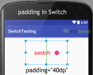
أدناه قمنا بتعيين حشوة 20dp من جميع جوانب المحول.
<Switch
    android:id="@+id/simpleSwitch"
    android:layout_width="wrap_content"
    android:layout_height="wrap_content"
    android:checked="true"
    android:text="switch"
    android:layout_centerHorizontal="true"
    android:textOn="On"
    android:textOff="Off"
    android:textColor="#f00"
    android:gravity="center"
    android:textSize="25sp"
    android:padding="40dp"/><!-- 20dp padding from all the side's-->
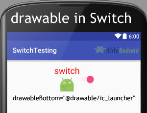
أدناه قمنا بتعيين الرمز على الجزء السفلي من نص التبديل. يمكنك تجربة الثلاثة الآخرين بنفسك.
قبل أن تجرب هذا ، تأكد من أن لديك صورة رمز في مجلد قابل للرسم
<Switch
    android:id="@+id/simpleSwitch"
    android:layout_width="wrap_content"
    android:layout_height="wrap_content"
    android:checked="true"
    android:text="switch"
    android:layout_centerHorizontal="true"
    android:textOn="On"
    android:textOff="Off"
    android:textColor="#f00"
    android:gravity="center"
    android:textSize="25sp"
    android:drawableBottom="@drawable/ic_launcher"/><!--drawable icon to be displayed in the bottom of text-->
مثال على زر التبديل Switch في Android Studio :
فيما يلي مثال على Switch في Android Studio. في هذا المثال ، نعرض مفتاحي تبديل وزر "إرسال" باستخدام الخلفية والسمات الأخرى كما تمت مناقشته سابقًا في هذا المنشور. عندما تنقر على زر الإرسال ، يتم عرض الحالة الحالية لكل من المحولين في Toast. فيما يلي شرح الناتج النهائي والكود والمثال خطوة بخطوة:

في هذه الخطوة ، نقوم بإنشاء مشروع جديد في android studio عن طريق ملء جميع التفاصيل الضرورية للتطبيق مثل اسم التطبيق واسم الحزمة وإصدارات api وما إلى ذلك.
حدد ملف -> جديد -> مشروع جديد املأ النماذج وانقر فوق الزر "إنهاء".
الخطوة 2: افتح res -> layout -> activity_main.xml (أو) main.xml وأضف الكود التالي:
في هذه الخطوة ، نفتح ملف xml ونضيف الكود لعرض مفتاحين وزر عادي واحد.
<LinearLayout xmlns:android="http://schemas.android.com/apk/res/android"
    xmlns:tools="http://schemas.android.com/tools"
    android:layout_width="match_parent"
    android:layout_height="match_parent"
    android:orientation="vertical"
    android:paddingBottom="@dimen/activity_vertical_margin"
    android:paddingLeft="@dimen/activity_horizontal_margin"
    android:paddingRight="@dimen/activity_horizontal_margin"
    android:paddingTop="@dimen/activity_vertical_margin"
    tools:context=".MainActivity">


    <Switch
    android:id="@+id/simpleSwitch1"
    android:layout_width="wrap_content"
    android:layout_height="wrap_content"
    android:layout_gravity="center"
    android:checked="false"
    android:text="switch 1"
    android:textOff="Off"
    android:textOn="On" />

    <Switch
    android:id="@+id/simpleSwitch2"
    android:layout_width="wrap_content"
    android:layout_height="wrap_content"
    android:layout_gravity="center"
    android:layout_marginTop="20dp"
    android:checked="true"
    android:text="switch 2"
    android:textOff="Off"
    android:textOn="On" />

    <Button
    android:id="@+id/submitButton"
    android:layout_width="wrap_content"
    android:layout_height="wrap_content"
    android:layout_gravity="center"
    android:layout_marginTop="50dp"
    android:background="#009284"
    android:padding="10dp"
    android:text="Submit"
    android:textColor="#fff"
    android:textStyle="bold" />
    </LinearLayout>
الخطوة 3: افتح التطبيق -> جافا -> الحزمة -> النشاط الرئيسي. جافا
في هذه الخطوة نفتح MainActivity حيث نضيف الكود لبدء مفتاحي التبديل وزر عادي واحد. ثم نقوم بحدث النقر على الزر ونعرض نص الحالة الحالية لـ Switch باستخدام نخب.
package example.abhiandriod.switchexample;

    import android.support.v7.app.AppCompatActivity;
    import android.os.Bundle;
    import android.view.View;
    import android.widget.Button;
    import android.widget.Switch;
    import android.widget.Toast;

    public class MainActivity extends AppCompatActivity {

    Switch simpleSwitch1, simpleSwitch2;
    Button submit;

    @Override
    protected void onCreate(Bundle savedInstanceState) {
    super.onCreate(savedInstanceState);
    setContentView(R.layout.activity_main);
    // initiate view's
    simpleSwitch1 = (Switch) findViewById(R.id.simpleSwitch1);
    simpleSwitch2 = (Switch) findViewById(R.id.simpleSwitch2);
    submit = (Button) findViewById(R.id.submitButton);
    submit.setOnClickListener(new View.OnClickListener() {
    @Override
    public void onClick(View view) {
    String statusSwitch1, statusSwitch2;
    if (simpleSwitch1.isChecked())
    statusSwitch1 = simpleSwitch1.getTextOn().toString();
    else
    statusSwitch1 = simpleSwitch1.getTextOff().toString();
    if (simpleSwitch2.isChecked())
    statusSwitch2 = simpleSwitch2.getTextOn().toString();
    else
    statusSwitch2 = simpleSwitch2.getTextOff().toString();
    Toast.makeText(getApplicationContext(), "Switch1 :" + statusSwitch1 + "\n" + "Switch2 :" + statusSwitch2, Toast.LENGTH_LONG).show(); // display the current state for switch's
    }
    });

    }
    }
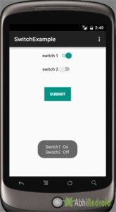
المخرجات :
الآن ابدأ تشغيل AVD في Emulator وقم بتشغيل التطبيق. سترى مفتاحين وزرًا واحدًا. الآن قم بتغيير حالة المفتاح (أي محدد أو غير محدد) وانقر فوق الزر. سترى الحالة المعروضة على الشاشة باسم Toast.